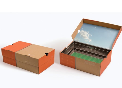
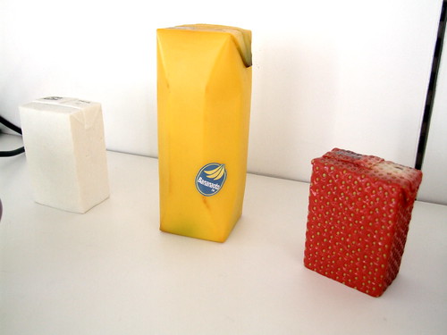
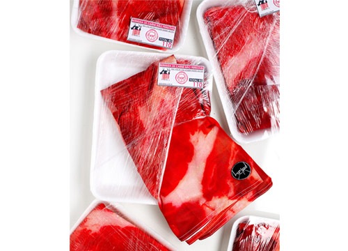
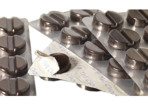
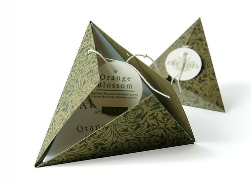
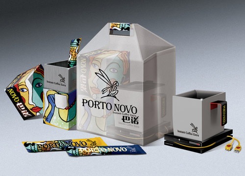
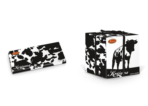
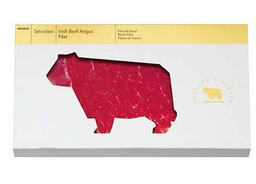
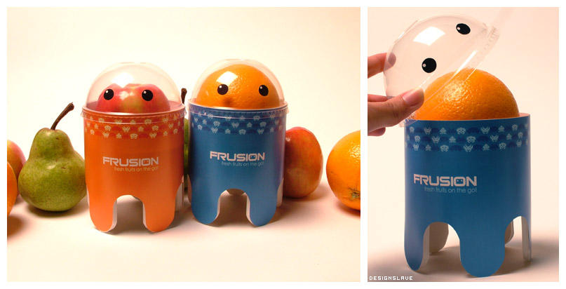
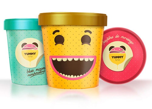
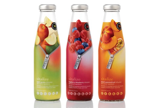
La creatividad es el término que definiría a cada uno de estos ejemplos. La combinación de colores que los conforma es impredecible, sus construcciones son complejas, divertidas y completamente únicas y la meta en común es lograr sorprender a los consumidores y lograr la compra de estos productos.
No importa la estructura, la simetría, la paleta de tonalidades, la tipografía, ya que en este proceso de diseño todo se vale. La meta es innovar en toda la esencia del empaque con la mayor cantidad de elementos creativos posibles, sin importar el estilo y sólo enfocando la atención a darle una gran personalidad a los productos, por medio del estuche que los contiene.
En esta ocasión te traemos algunos de los ejemplos más creativos en el rubro de diseño de empaques. Estamos seguros que cada una de estás imágenes te serán de gran inspiración para el desarrollo de tus próximos proyectos y diseños.
Naoto Fukasawa Packaging
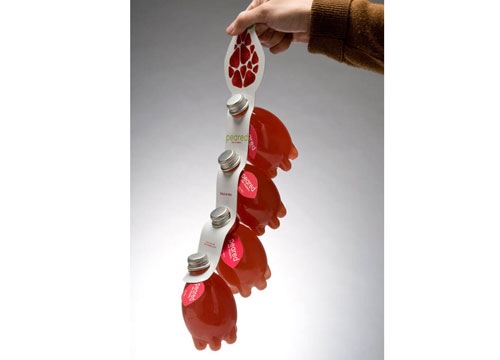
Dumbbell Packaging
![[mrclean_1.JPG]](https://blogger.googleusercontent.com/img/b/R29vZ2xl/AVvXsEhskJaJHohCKpbdnQvNIWWQVpv4URXLOmhTIu8XEQpdxq8uw54RBULpHz4yQYHc4izzXK1-K-Y4WFlc0puyxUnegSnGtIff1_DYD0iPTLsjMT5_Zf9lhhtjnbfmYEaoOyYyW6ZzKORs1aal/s1600/mrclean_1.JPG)
![[mrclean_2.JPG]](https://blogger.googleusercontent.com/img/b/R29vZ2xl/AVvXsEiQTmFLcP7VLpC-h_t2MQXp8DTR3DtSdhhZ_Gz5oSzGl4Q_JnLVkjZdIvaxyr9Sw2KgKHduMch4nYZWaCZVlcGHobo92Bb7AVHZznqnMxNgTffuWOakWhBnWXOgdvREvU_1jCqNicUPk2TA/s1600/mrclean_2.JPG)


Designed and illustrated by the very famous Yuko Shimizu. She is a freelance illustrator based in New York City and an illustration instructor at School of Visual Arts. Newsweek Japan has chosen her as one of "100 Japanese People The World Respects" in 2009.

At INQ we make a new type of handset - the Social Mobile - designed for the way people communicate today. The services we’ve built into the device are there to be used, and not sit stranded and unwanted in some obscure sub-menu.
Communication is at the heart of everything we do. We express this in our brand through one of its most striking and creative aspects: art. Not in any lofty way, but in vibrant and streetwise forms: illustration, comics, film - whatever we like really, whatever catches our eye.


With the INQ¹ box we wanted to create an object of beauty - something to cherish not chuck. All too often, packaging needs up in landfills, or recycling bins at best. While we’d like people to keep it, use it and treasure it.
When we design our handsets we remix and edit internet services so that the play best on a mobile. Similarly, we remixed the idea of a box and made it into a place to display artwork. The box art, and the illustrations on the help cards, come from people whose work we really like.
 |
| Home | Design |
| The Dumbbell Sports Drink designed by Jin Le. I love this bottle design. The bottles can be filled with the water or electrolyte infused sport's drink, each bottle weight scant 0.5 kg. After you drink it up, you can also fill it into water or sand to make your dumbbells. |
  |
No hay comentarios:
Publicar un comentario